
For the third year I took a intensive course with the California Rare Book School in August in San Francisco. This year’s course was on the history of typography, taught by Paul Shaw, designer and design historian, with Grendl Löfkvist, printer and Education Director at the Letterform Archive. I had heard Paul give a lecture at the Book Club of California a few years ago, entitled Beyond the Spine: A Closer Look at W.A. Dwiggins’s Book Designs for Alfred A. Knopf.


In my studies of the book, typography was honestly the aspect that interested me the least. I have always looked past the type when reading and focused on the content. As far as the book as a structure, I have found more to appreciate in the binding than I have in the style of the letters. Peter Koch‘s class from a few years before opened my eyes to fine printing, but I still wasn’t focusing on the design of the type. This class with Paul Shaw brought me to that next level of appreciation for the book. I will never be able to read anything again, whether it is an advertisement on a subway wall or a fine press book, in quite the same way.
")
")

")
")
In one intense week, Paul led us through the history of script (looking at incunabula at the Bancroft Special Collections at UC Berkeley), into printed texts (different printing technologies and development from type foundries such as M & H Type Foundry), through modern digital typography (including Carol Twombly and sample fonts provided by Adobe). It was an overwhelming amount of information at first. I was glad to have taken a class in the history of printing as well as a beginning letterpress printing class. I think it would be challenging to appreciate typography without understanding the development of printing and its technology. I would also say that the study of typography connects closely to the study of linguistics, but I haven’t had time to think through that and see what is written about the connections.
")
")
Classification of Type
- Old Style (This includes Jenson, Griffo, Garamont, Caslon.)
- Venetian
- French
- Dutch Old Style
- Transitional (This includes Grandjon, Fournier, and Baskerville. I was attracted to Fournier.)
- Modern or Neoclassical (This includes Didot, Bodoni, Walbaum, Prillwitz)
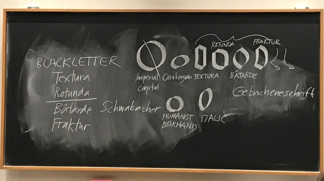
Within all these there other design movements that shaped the development of type, such as the Arts and Crafts movement (led by William Morris), Art Deco, Bauhaus, etc. And the technology changes and innovations in printing over the years. Not to mention what happens to type after World War I and II, and the introduction of the field of marketing and advertising as a design profession. I found the development of Blackletter and Fraktur to be particularly interesting in terms of the connection between type and national identity as well as social memory. Paul has co-edited a book on this topic called “Blackletter: Type and National Identity” which I recommend.

The class had the honor of being invited to the Private Press of Fred and Barbara Voltmer, Havilah Press. The Voltmers showed the class several rare books with typography specimens and gave us a tour of their bindery and press. I had heard about the Voltmers as important figures in the San Francisco Bay Area printing world, and was honored to finally have the chance to meet this dynamic couple and tour their studio.
 The class also spent a day reviewing type specimens at the Letterform Archive in San Francisco. This collection is amazing. I ended up purchasing a first edition copy of Tolmer’s Mise en Page after reviewing a copy at the Archive. They also have a collection of Mai ’68 posters (research from my Master’s Thesis) so I plan on making a trip back in the near future to look at those.
Like I said, the amount of information in the class was overwhelming. Paul has a wealth of experience and knowledge. Grendl’s contributions to the class as an experienced printer and teacher were invaluable. They made for quite the team. I have half a notebook filled with rich notes from this class with many asterisks to remind me of future resources to research and new vocabulary to learn. I will post some of the resources that were referenced by Paul and Grendl during the class as well as the books that Paul recommended that we read.
Books I read before the class for general background
Historical Scripts, Stan Knight (Oak Knoll Press, 1998)
Historical Types, Stan Knight (Oak Knoll Press, 2012)
Point and Counterpoint
The Crystal Goblet by Beatrice Warde (1932)
Clarety: Drinking from the Crystal Goblet by Gunnar Swanson (1994)
On my to-read pile for typography
Palatino: The Natural History of a Typeface, Robert Bringhurst (David R. Godine, 2016)
Futura: The Typeface, Petra Eisele et al (Laurence King, 2017)
The Visual History of Type, Paul McNeil (Laurence King, 2017)

Type Anatomy from DoubleStory.org at http://doublestory.org/type-anatomy/
Punch Cutting – Nelly Gable at the Imprimerie Nationale in France
