I spent the last months of 2022 making slow but steady progress.
Upcoming Fine Press Book

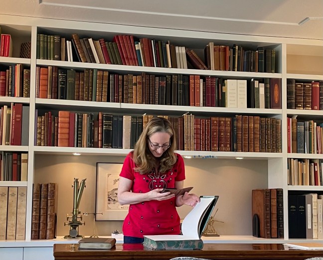
First, I’m collaborating with a talented wood engraver, Keith Cranmer, for the publication of a fine press, limited edition book. I’ve had the manuscript of the book for almost a year now. Keith will be creating around 25 illustrations for the story, some will be line drawings and others will be wood engravings. We have met several times and discussed the type of illustrations that will work and also the style that I want to produce not just for this book, but for other projects for the press. More will become clear when I’m ready to announce my press and intentions for what I’ll be producing.
At this point, the digital layout of the book is waiting for the illustrations before I can finish the imposition (printing 4 up this time) and have the photopolymer plates created. Dina Pollack, talented printer and book artist, has generously continued to guide me through this process for the third year in a row. My current thinking is to print the entire book on the plates and then go back to add in the full page and smaller wood engravings. I’ve also been discussing the project with limited edition bookbinder, John DeMerritt, and have an idea of what he will need from me on the pages.
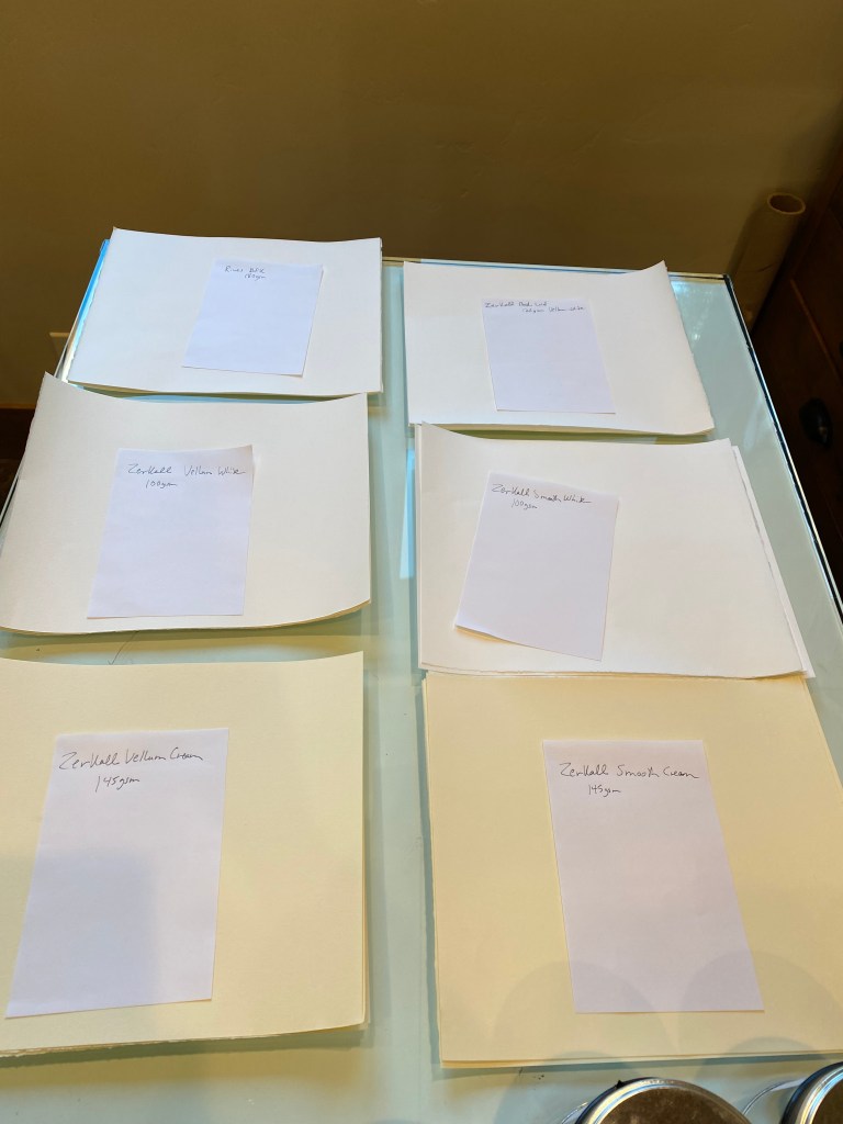
My biggest challenge so far has been finding the right paper for this project. I have ordered many samples from all over the world. Zerkall Paper was the ideal fine press book paper, but the historic paper mill was flooded a few years ago and any paper that still exists has been bought up, mostly by other fine press printers, and is hard to find. Apparently, there are no plans for the company to start making paper again. I have purchased what was left of Zerkall book paper from Talas, but it wasn’t enough for the full run of this book. I may save it for the deluxe version of this or another publication. I have looked at everything I can find that might work – from a variety of Japanese papers to reaching out to Two Rivers for custom handmade paper.
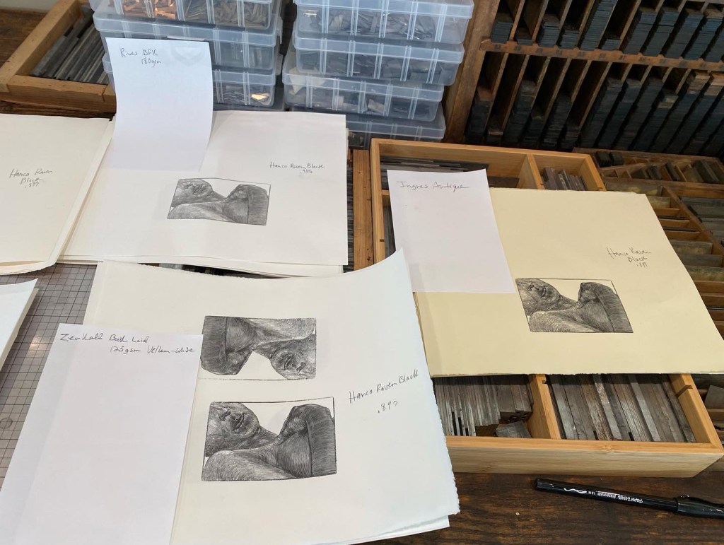
To test papers, I printed a sample wood block loaned to me by the artist on various forms of paper using different oil-based inks. I’ve got a few more paper samples left to try that came in from J. Hewitt in the UK over the holidays. Perhaps I will find the perfect paper in those samples!
The catch is finding one that has a nice drape, so not too stiff. It has to be smooth for the wood engravings but also be thick enough that it won’t bleed through too much to the other side when text and woodblock are on the opposite pages. I will leave a blank page behind the full page wood engravings, but for the pages with a combo of text and line drawings or small engravings, this could be an issue.


I’ve also been looking for the best oil-based ink to use for this project. I tried around ten different inks. I am going with the Hanco Raven Black, but in the process, I enjoyed noticing the variations that exist in black ink. Really fun to experiment in the studio.

Studying Typography
I don’t have a graphic arts or any kind of arts background. I’ve created layouts for newspapers and magazines for different organizations since high school. Remember PageMaker? Even when I was in middle school I designed my own newspaper for an all girls secret clubhouse (very exclusive limited edition copies of this). That said, I’ve learned layout and design from trial and error and studying what I like and don’t like in publications.
When I open Adobe Fonts today to search for the right typefaces, my head swims with possibilities. I can spend hours side-tracked with ideas for books or stories based on a typeface family that sparks my imagination. Even after taking a UCLA Rare Book School class on typography a few years ago from Paul Shaw, I didn’t feel as confident as I would like. I needed help.
It’s clear that typography is a key component in book design. It helps to express the content of the book and adds to the readers experience of the text. How do designers make the decision to use one typeface over another? Why do I prefer some more than others? I started reading typography books, but still wanted help from a professional.
So I asked Russell Maret, master printer and book artist, for guidance. He pointed me to Ben Keil of XYZ Type who was generous to offer me a few private lessons specifically focused on selecting typefaces for fine press book production. I’m hoping to have a few sessions with him in the upcoming year to get a better understanding about the best way to go about selecting typefaces and how they complement each other in the design of a book. Sometimes you just like what you like, but there are definitely differences in typeface for letterpress versus digital or offset printing projects.
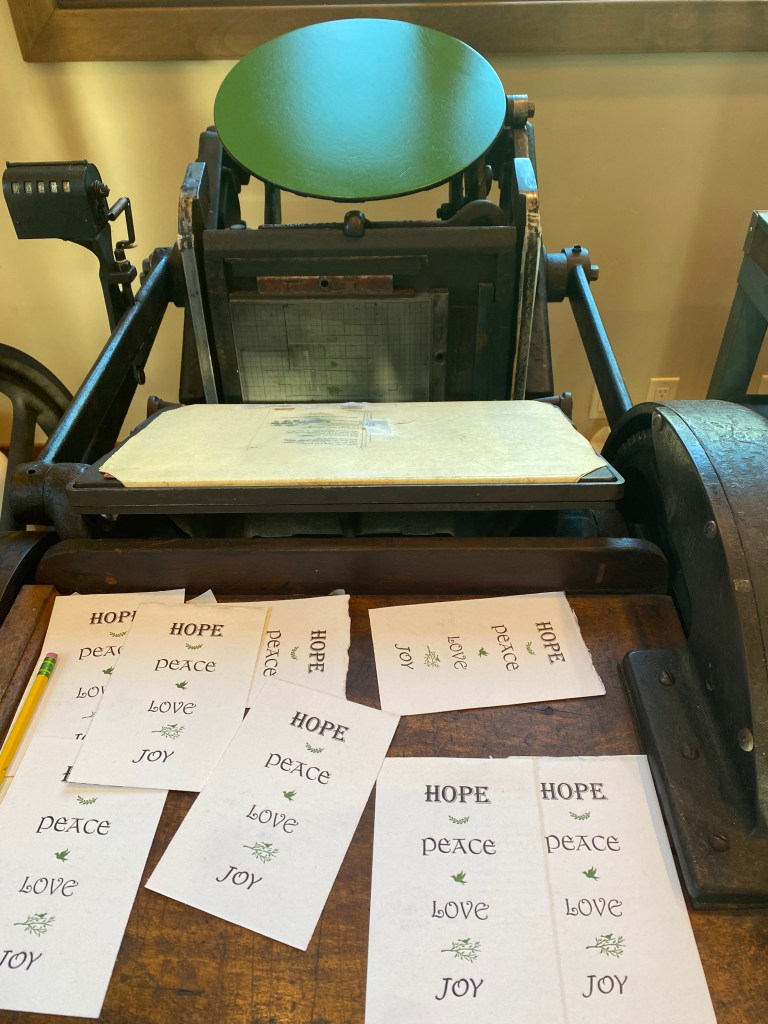
Continuing to Build Printing Skills
I invited Li Jiang, of Lemoncheese Press, over to my studio to teach me about make-ready and packing. While I knew a little about packing for my presses, I was not aware of how much more I could be doing to improve.
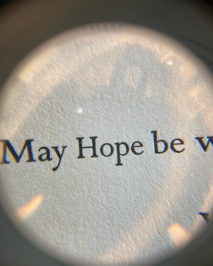
Li taught me how to use a loupe to examine my printing and what to look for in the consistency of the ink and the quality of the printing across a page. After identifying problems or areas where the printing could be improved, then the packing can be adjusted to correct or enhance.


Additionally, I now know how important it is to consider the printing process of the press earlier on in the design phase when laying out illustrations and boarders with text and white space. Knowing how the press works, whether its a platen or cylinder makes a difference in how the plate might print and how much work will need to be done at the press to compensate. There is a real skill to this. I’m grateful to Li for sharing her knowledge with me. I decided to practice what I’d learned by….
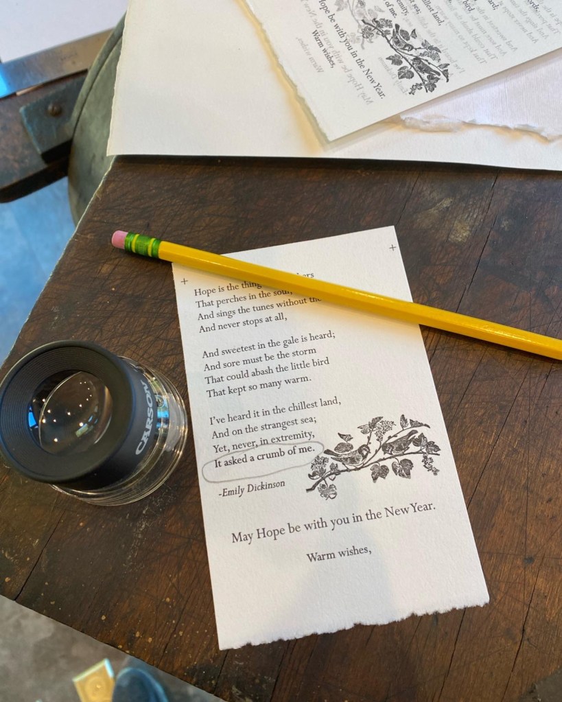
Making a Simple Holiday Card
As I mentioned, I have a ton of paper as part of the process of finding the right one for the book project. I used a thicker, handmade cotton paper that I had purchased from a paper maker in SC. I kept the design simple, numbered my proofs, and played around with the packing.
I would not have made such wonderful progress without the generous time and encouragement of so many people in the book arts community. I also became a Grolier Club member over the summer and have joined a marvelous tribe of fellow book collectors who treasure and wish to preserve the history of the book and the book as object. Today’s fine press limited edition books will be tomorrow’s rare fine press books. Therefore, I believe I’ve found a good balance this year between the collectors and the creatives of the new arts and crafts book movement. I’m looking forward to a productive new year.
Coming in 2023
-launching the name of my press and introducing my intentions for that publishing venture
-finalizing the imposition for the book with its illustrations and PRINTING!
– working with a new writer to collaborate and get the next book into the queue for production
– continuing to learn from the amazing network of printers and book artists that live in this area. I am so grateful for their generosity and kindness.
Happy New Year!
